Friday 9 June 2017

Course review

The course is completed, and there have been times during the past 13 months when that has seemed unlikely. The OCA rules of leaving no more than a year between modules dictated that I had to commence the course last Spring even though from a personal angle this was far from ideal. Our youngest son Mark was ill, terminally so, and we needed to help him as well as spending as much time with him as possible. Tutor helped with encouraging comments when I very nearly gave up the course last December.

As I write this I still cannot quite take in that Mark is no longer with us. I always knew that his chances of long-term survival were not high, but there was always hope until the last few days; Mark defied the odds to live over 13 years from having a very serious primary cancer. He achieved more in his 28 years and 11 months then many of us in a lifetime. He became a doctor. He found love. He won awards: British Citizen Award; Cancer Research UK Ambassador of the Year; TopDoc; Leicester University Alumnus of the Year; and several others. Mark's CRUK fund stands at £182k and still generates more income in small steady increments. 

But more than that, he was a wonderful person; everyone he knew loved him to bits. No-one could dislike him because he was so striaghtforward and personable. He leaves a huge hole in our lives that will never be closed; we just have to live with it somehow.

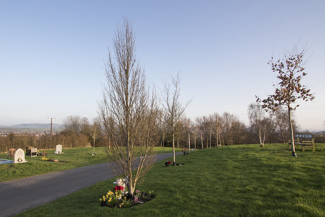
During this period, OCA Landscape appeared at times to be an indulgence. It is one thing having to deal with the necessities of life when a loved one is seriously ill, another to progress with what is not essential. We cannot curl up into a ball and disappear for a year, but Mark had to be at the focus of our attention in this period. The practicalities aound Mark's illness impacted on Assignment 6 in particular, as described in the relevant post.

At other times, though, the course has been quite cathartic. This is the flip side of the above: that we have to recuperate, to think about something else, to 'be normal' for a while simply so that we could better help Mark when he needed us. I was working on the feedback for Assignment 4 just two days before Mark died. And since he has died, the final two Assignments have provided a useful part of the recovery process, providing focus at times when felt down. I could have taken a few months out from the course, but at no time did we know with any certainty how long Mark would survive. Even two weeks before he died, doctors were suggesting he might live for several months. And I think I would have lost momentum; in all four courses I have had long gaps between all the modules, but once started tend to get on with the course.

Trying as hard as one can to put the personal considerations aside, I have enjoyed Landscape. I like the reading and the discussion element. I have no aspiration to be any more than a decent amateur photographer so consider the history and the analysis adds to my knowledge of photography as an evolving practice. This academic side of the subject enriches your general knowledge and appreciation of the subject. I found Assignment 4 to be challenging, but welcomed the opportunity to assemble an argument about a subject (the future of photography generally, and of Landscape imagery specifically)  that interests me. I found interesting subject-matter for the other Assignments. 

As Tutor noted in Assignment 5 feedback, perhaps technical execution does not match the research and thought. There is further development here, as Tutor succinctly sets out:
"...getting better (photographically speaking) is a long old journey - we’re all on it!"
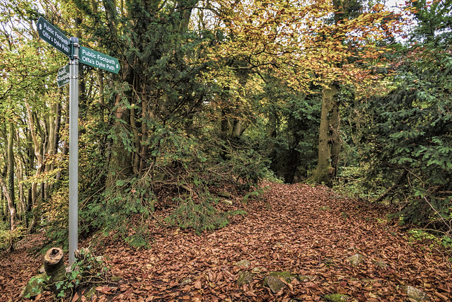
I was pleased to be able to integrate my interest in human geography that has not disappeared since studying it at university in the 1970s, and my love of walking Trails, into the coursework and Assignments. Tutor mentions in Assignment 5 feedback about 'raising aspirations' such that visual work becomes as strong as written work. That could be work in progress.

If I pass this module, intention is to complete Level 2 with Digital Imaging and Culture; this module seems to fit best with my interests.

Thursday 8 June 2017

Postscript: Is Photography Losing Its Impact?


“The inventory started in 1839
and since then just about everything
has been photographed, or so it seems.”
Susan Sontag – On Photography

Reading a few of the blog entries, and specifically Assignment 4, will evidence a continuing and evolving thought: quite simply that photography in the traditional sense is under threat; whether subsumed by the sheer volume of output, or overwhelmed by alternative means of visual expression.

I read an article by Fredercio Algeria that raises exactly this issue. He introduces thus:
"The following words may sound like a rhetorical exercise, but I'm really worried about my question: Will humanity be able to be impressed by photographs in the same way classical, iconic images have changed the perception of real-life situations? Will we, as human beings, be able to save meaningful images in our brains even though we are progressively bombarded by visual content on the news, internet, social media, and traditional ads?"
He quotes Sonntag, above.

Algeria argues that the democratization of the media has made us less impressionable - basically the argument I presented in Assignment 4 - either because of the sheer volume of strong images or that strong images do not linger in the memory. I would argue both are true as they are interdependent, particularly due to the advent of smartphones; this article suggests that humans have a shorter attention span than goldfish due to smartphones.

The solution, according to Algeria, is twofold: prepare output in photobook or other tangible printed medium format; and create immediacy.

The first response is predicated on the notion that a non difital image forces us to pay more attention, to focus, to slow down in our response as a viewer. I have been against printed images for years on the basis that they are elitist, both because they are expensive in time and cost to produce well (albeit, admittedly less so now) and, more important, they restrict one's audience. Printing is essentially a gallery concept for those who wish to enter a gallery; it is not for those who physically cannot or who feel intimidated by galleries. And I use galleries eclectically here, to include camera clubs and other means of displaying physical imagery. If we want to broaden the reach of photography, then surely we should encourage, and accept the deficiencies of, digital imagery (plus, of course, digital imagery is now common in galleries, see MOMA blog, for example). 

But I do accept Algeria's point to a degree. There is only so far as democratization can go. Not everything can be Art (it might be art, but not Art). A series of Snapchat selfies replete with online filters is probably not going to cut it artistically (though let's not doubt the ability of someone producing a collection of exactly that in the name of Art). The problem then becomes definition: who has the right to call a photograph Art? There is a risk that the definition does itself become elitist, exactly as Berger argued nearly 50 years ago now in respect of Painting.

Algeria' second argument is not enunciated well - immediacy appears to mean keeping a few printed images in a bag to show people. I am less convinced about that as an approach.

Algeria says he is not against democratization, but recognises the artistic tensions that are caused by  democratization. There is probably not much one can add to that because, quite simply, democratization and Art work in opposite directions.


Monday 22 May 2017

Assignment Six feedback

Assignment Six feedback was brief:
"This is a shorter report than usual as I’m not commenting on any projects/ research. You’ve done exceptionally well to complete this course given your recent bereavement".
The study is well received. Tutor notes I omitted a stage in Autumn when leaves changed colour. As explained in my narrative, this was caused by personal difficulties. The typo on dates referred to has been changed.

The advice re positioning is well received.  I still think I should have allowed a wider composition to start with, both to allow for positional change and tree growth. Photoshop cropping now has the tool to fill white space when cropping, which I used with one image, but a wider perspective would have allowed a perfect alignment. Or perhaps I have seen too many car commercials.....

Have taken on board tutor's suggestion to present in book format; this is now part of the assessment submission. The output looks very good and is something to treasure after what has been a traumatic year. The slideshow is available on Flickr:

Assignment 6

In honest answer to the question about practitioners mentioned in the Assignment, no I did not consult any of them. This was mainly because I decided what to do based on a previous OCA Assignment from another student that viewed a landscape image in different seasons. I thought an extension of that to a tree in an artifical environment that might itself develop over a year (it did not but that would have been a bonus rather than material) would work well. I was aware of the need to do this Assignment from other blogs, so found what I wanted to do before even signing up.

Not that that of course prevents one reading and viewing the work of other practitioners. I am aware of Paul Hill's seminal work  in The Peaks of Derbyshire demonstrated different tonality using a medium grey medium, a deliberately challenging way of viewing the landscape by removing colour from the equation. It is good photography but actually represents the antithesis of my effort, which is largely based on colour transition, both the intensity of the greens (in particular) but also how the seasonal weather transition affects the viewer's reaction.

I looked up Klett and Byron, and came across these examples of their work:
Byron Wolfe, 2003. The life of a cloud. Available from http://www.byronwolfe.com/2010/12/the-life-of-a-cloud.html. Accessed on 21 May 2017.

Mark Klett and Byron Wolfe, 2007. Details from the view at Point Sublime on the north rim of the Grand Canyon, based on the panoramic drawing by William Holmes (1882).
Available from http://www.byronwolfe.com/grand-canyon/.
Accessed on 21 May 2017.
The former chimes very directly with my approach, and I experimented with a similar presentation, as may be seen online here, and set out below:

 
A very interesting exercise, and have learnt some techniques of presentation.

Wednesday 12 April 2017

Assignment Five feedback


The summary includes: 
"Your level of reflection and research given the circumstances you produced the work under are both thorough and extremely engaging, successfully marrying your interests in history, human geography and the arts. The research evident within your writing demonstrate a fluidity of thought, of which the act of photographing becomes part of the research process. The technical execution of this body of work does not yet reflect the research and thoughts behind it with such fluidity, but I suspect this is something you know already and see more of the longer photographic journey you are on."
That is a reasonable summary; I undertook this module because it allowed me to synthesize several interests, not just photography. Perhaps a little more around what is meant by the technical execution would help. My concern was that the images were considered not very good. I queried this in email correspondence, with reply as follows:
"No that’s not what I meant, so good job you asked!.....What I was getting at was that I think you’re doing yourself a dis-service if you put yourself down in terms of not wanting to produce something other than the typical landscape image. I know you understand how to communicate on a deeper level within your writing/research, I think at present, the visuals aren’t as strong as the written work. I was trying to raise your aspirations! Does that make sense?"
And in a subsequent email:
"I think you’re doing exceptionally well given the circumstances and that getting better (photographically speaking) is a long old journey - we’re all on it!"
That puts one's mind at rest. It is one thing to say 'nice commentary, shame about the images', another to say that 'the images are fine but perhaps do not match the strength of of the commentary' It seems that the latter is the way to read the comments, whereas my concern was that it was the former. I certainly have no issue with that conclusion. I love the writing and the analysis; to a degree the photography is an adjunct to that but one that could be developed further. This is perhaps an example where the written basis of feedback does not allow sufficiently for the 'flavour' of comments to be expressed.

The subliminal part of the assignment appears to 'work best'.  I would agree with that, and it could have been developed as the sole (or main) object of the exercise, combined with Tutor's idea that the note image could be used to 'script an entire walk'. I would contend that the set as presented does at least partially achieve that; providing a sense of the surreal within a broader remit of words within the landscape, and a contrast in the way language is used within the landscape.

Tutor adds points about lack of cohesion. Was unsure what this referred to and received following on querying:
"The lack of cohesion, as I see it, is that the images are strong singular images that communicate in one way, whilst the text sits next to it in a way that doesn’t quite feel cohesive."
The point about a lot of the text was to enrich the experience - to extend the viewer's appreciation of what he or she is looking at, to add context and information. It is a subjective point.


Tutor comments that text works well, albeit the text was half hidden in the Flickr presentation. That is an irritating feature of Flickr. I tried several approaches unsuccessfully - the viewer can use zoom function to mitigate - but I could find no way of incorporating all the image with all the narrative for some images. The crop required to view the text is minimal, and hopefully does not spoil the effect. Tutor says the text 'works well...strong and well written' but then wonders if 'it's too much to take in alongside the images'. All I can say is that the comments add to the context and it is not unusual for substantial text to be placed near images for amplification (open almost any page at random of Alexander's Perspectives on Place for example). 
 
There is a further comment wondering whether I looked at alternative formats, which made me think again. I had supplied prints and a Flickr presentation but an alternative could have been images with narrative on the prints - similar to a book format. This is mocked up on this link, and works quite well. Tutor also mentions evidencing a slideshow done in past. An example is one I prepared in respect of a cycling trip to Vietnam.


More generally, there is recognition of the multi disciplinary approach brought to this module. That is pleasing as I have tried to knot together human geography; an awareness of landscape and its amazing variety; and an interest in walking and journeys. Perhaps the 'technical' belies this to a degree, but the different dimensions I use hopefully more than compensate.. I enjoyed doing the Assignment for this reason.
 

Thursday 6 April 2017

Assignment Six Transitions

The Assignment is to produce a series of images responding to the idea of 'transitions' by recording changes in part of the landscape over an extended period of time.

A very specific location was chosen: Kingswood Remembrance Park, owned and managed by South Gloucestershire Council. The idea arose when walking through the park, and noticing how it is developing over time as more trees are planted and burial sites established. 

With the knowledge that it would take about a year to complete this course, I thought that a series of images following the annual cycle of a tree would be interesting, including withing the project a range of meteorological conditions and times of day. At the time, I thought the surrounding area might also show signs of progression as more trees were planted and burial sites established, but that has not occurred. 

The dates I could photograph the tree were proscribed partly by our son's illness as we were frequently with him in London, but the seven images incorporate the annual cycle of buds to leaves, to bare branches, and back to buds again. 

Landscape appearance reflects the light and weather conditions, and the sequence reflects that. The exact details of date, and time of day are available on the Flickr presentation:

Assignment 6

It  was evidently desirable to take images as closely as possible from the same position. This proved more difficult than thought because there was no way of marking exactly the position from where the first image was taken. I made a visual record of the details from the initial shoot as follows:


The subsequent images were taken as closely as possible from the same position; with hindsight I could have chosen a point say on the roadway that would have been easier to replicate; however, at the initial stage I believed we would see a more dynamic picture of the landscape in the background over a year than actually occurred. Positioning the tripod to the left above would have included a less dynamic background. There is inconsistency between the images but hopefully not enough to spoil the overall effect. 

In technical terms, this was a more challenging assignment than I envisaged. It is remarkably difficult to get an entirely consistent view; if I were to repeat, I would take a wider angle and crop the images appropriately.

In more general terms, it has been an interesting assignment to carry out, notwithstanding the practical difficulties mentioned above. The project has shown how vastly different the same scene can be at different times of the year, at different times of the day, and in different weather conditions. Landscapes evoke emotion, but that emotion is affected by the environment in which they are seen. Quite often, we select our conditions to go with the subject, to present it in the best light for technical reasons, and this is true to a degree of this project. The camera points almost easterly; this dictates that early morning shots were possible (and desirable) in the low sun months of autumn and winter but early evening shots better at other times. On one occasion the relative flatness of the scene in rainy conditions was demonstrated


Wednesday 22 March 2017

Assignment Five Self-directed project

"Nothing......is more extraordinary in Britain than the beauty of the countryside. Nowhere in the world is there a landscape that has been more intensively utilized - more mined, farmed, quarried, covered with cities and clanging factories, threaded with motorways and railway lines - and yet remains so comprehensively and reliably lovely over most of its extent. It is the happiest accident in history" (Bill Bryson, 2015)
A theme of this module for me has been the marrying of an enduring interest in the astonishing variety of the British landscape - how the human and the natural sit side by side for the most part in harmony despite often well publicised local protestations to the contrary - with that of photography. Bryson enunciates more eloquently than I, but his sentiment accords perfectly. 

The apotheosis of the extraordinariness is Britain's network of National Trails, 21 walking journeys totalling 3,029 miles along some of the finest and most varied scenery you could hope to see. I have walked six of these, and am currently walking the 870 miles of the Wales Coast Path over about three years, not yet recognised as a NT but characteristic of those that are. One section was used to describe a journey for Assignment Two. Encouraged by the course notes to look for a subject closer to home, the bizarre folly of William Champion was the focus of Assignment 3.

I had no preconceived ideas for Assignment 5 but an empathy arose with Bryson's thoughts as I walked Offa's Dyke Path, ('ODP') the 177 miles from Chepstow to Prestatyn that actually follows the dyke for only about a third of its length. It is a good subject, but to do a 'journey' again seemed to be a repeat of A2; there was a need to incorporate more of what has been learnt during the course, and to focus on a more narrow, more consistent theme. Tutors have commented on this in previous Assignment feedback. Feedback from A3 included that there is a 'sense of ticking off these things' in the collection of icons in Champion's gardens; feedback from A2 was to make a more consistent presentation. 

Looking back at the proposal written in December there is a lack of focus (perhaps hardly surprising when one's mind is distracted by the serious illness and subsequent death of a son a few weeks later) but I did note the use of narrative, that becomes the focus this Assignment. More specifically, the Assignment examines words within the images to generate messages in three distinct ways:
  • direct - the obvious ; the directional, the informative;
  • indirect - the contextual; the implied; the understanding;
  • subliminal - the poetic; the mystic; the inviting.
Three groups of five images are utilised to demonstrate the above. Words are evident in all bar the last, that has special quite deliberately situated mystic message perhaps saying more than any other. 
The inspiration for this project comes from several sources:
  • Semiotic analysis, specifically the work of Barthes (1964) who extended the Saussurian linguistic distinction between signifier  and signified  to imagery, establishing the principles of denoted (literal) and connoted (symbolic) messages. Barthes own writing included also the linguistic message as a third element although commentators (e.g. Howells and Negreiros, 2012, p118) frequently discuss only the binary distinction. Barthes (ibid, p37) identifies text as helping 'to identify purely and simply the elements of the scene'. This anchorage serves to 'fix the floating chain of signifieds in such as way as to 'counter the terror of uncertain signs'. It is unlikely that the people who placed the way markers for ODP were aiming at countering terror but the function of the words and messages in the direct group of images fit with the concept of the literal message; those of the other groups with the concepts of signifier and signified;
  • The importance of narrative to add meaning and coherence to a set of images. As mentioned above, this was an area of development. There is an intended irony that the  the words are part of the subject; the narrative arises from the semiotic analysis;
  • Spontaneity. Short (2011, p129) sets out how she would spot something on a photographic shoot and 'make a mental note to look again for it in the future'. One one assignment, she noticed a freeze mark on the back of a horse she was photographing, and thought this symbol would make more sense in a collective of similar images of branding on other horses. Similarly, this project did not start with and intention to use words as a subject, rather the concept developed as examples appeared. The consequence is a portfolio containing material that is a by product of a journey, rather than the story being the journey. The downside of this approach is an inevitable lack of technical consistency. Short (ibid) had to use a variety of light, frame sizes and angles for her project; I have endeavoured to maintain some limited consistency with focal length but practical considerations (notably the physical constraints of where one could stand in a couple of the images, and the differing light conditions) mitigate against;
  • Richard Long's Text in Art (discussed and referenced in Exercise 2.5) is the ultimate in visual representation of words. His work is nothing to do with photography but a lot to do with landscape and its representation. Long represents the other extreme to Bryson; his apparent love of the landscape is enunciated in juxtaposing proper nouns with descriptive adjectives. Long's (and Bryson's) evocative approach deliberately eschews imagery in favour of imagination. This assignment endeavours to use imagery to evoke a range of outcomes, from the basic notion of 'this is the path', to a world of imaginary possibilities; 
  • There is a link beween imagery and other art forms that photography can explore further. I set out an example in a post discussing Sorted books..
The aim having been set, the choice of images was less easy. As said, this was a project that evolved. The alternative of selecting a subject, then photographing it, was used in Assignment 3. That approach runs the risk of 'finding what you are looking for'. An alternative that appealed for a journey based project was to use distance as a marker for where to take photographs. This acts as a constraint to avoid the problem of self selection. Mellor (1997) took three years to photograph the British coastline every 50 kilometres from a similar perspective. As Wells (2012, p273) observes, part of the interest of Mellor's project was that different regional histories emerged as an unintended consequence of the process. Power (2005) carried out a similar project by visiting the outer edges of each of the 56 pages of the London A-Z. Again, the realisation that the project was about social identity, evolved within the process (Wells, ibid p274).

The project is small enough (and thus accessible for printed imagery) that a justification for the choice of images is possible. This is available on the web presentation; undoubtedly, there is a high degree of subjectivity about whether the images and the groupings thereof 'work' in the way intended; there were candidates that would have demonstrated subtly different messages. But the idea is not to be comprehensive, simply engender thoughts about how we use words as part of our message within imagery. 

As a critical self evaluation, it can be argued that the project is contrived, an inevitable consequence of post hoc subject choice. But all projects are contrived in some way or another - those photographers who seek to demonstrate a subject or concept have a priori prejudices and preconceptions. And what photographer has an idea, goes out to photograph it, and returns with a blank film or an empty SD card?

Are the distinctions made real or not? Yes and no, is probably the only answer. The narratives for each image make the case, but there are alternatives. The problem with classification in artistic subject-matter is a lack of objectivity that mitigates against simple classification. A case could doubtless be made for each photograph to be included in another category, but that is too an inevitability of the process.

As regards the technical qualities of the images, using a tripod is logistically impossible in these circumstances - this is a journey of discovery not one of predetermined outcomes. And choosing a theme by self discovery means not choosing the 'best' pictures nor ones that fit a consistent technical model.

The images are all printed and submitted for comment. The contact sheet is set out below as a cross-reference and grouped as explained above.


The Artist's Statement is presented as a separate post. The digital presentation is below and is an integral part of the Assignment as includes explanations and rational for each image:

Assignment 5

References:

Barthes, Roland (1964) Rhetoric of the Image in Visual Culture: the Reader (1999) Evans, Jessica and Hall, Stuart (eds). SAGE. London.

Bryson, Bill (2015)  The Road to Little Dribbling: More Notes from a Small Island. Penguin. London.

Howells, Richard and Negreiros, Joaquim (2012) Visual Culture 2nd ed. Polity. Cambridge.

Mellor, Kate (1997) The Island. Quoted in Wells, Liz (2012) Land Matters: Landscape Photography, Culture and Identity. Kindle edition.

Power, Mark (2005) System of EdgesQuoted in Wells, Liz (2012) Land Matters: Landscape Photography, Culture and Identity. Kindle edition.

Short, Maria (2011) Context and Narrative. AVA. Switzerland.

Wells, Liz (2012) Land Matters: Landscape Photography, Culture and Identity. Kindle edition. 

Sunday 19 March 2017

Sorted books

I came across the Sorted Book project by Nina Katchadourian by chance, It is a great concept: arranging book spines such that their juxtaposition of titles makes a message, usually ironic and jokey.

It has become quite a craze of book spine mashups - see this link for example. 

The concept is an example of how interdisciplinary art can work. I have used the idea of photography and words working in harmony as a driver behind Assignment 5. This prompted me to devise a few book spine mashups involving titles that I have collected over the five years of OCA mashed in with some others, as follows: