Showing posts with label Assignment Feedback. Show all posts

Monday, 22 May 2017

Assignment Six feedback

Assignment Six feedback was brief:
"This is a shorter report than usual as I’m not commenting on any projects/ research. You’ve done exceptionally well to complete this course given your recent bereavement".
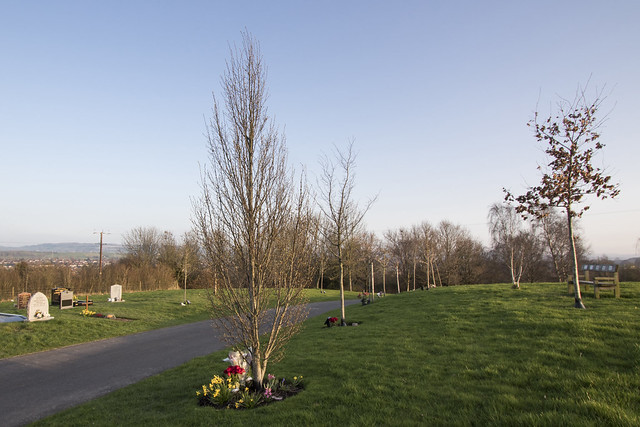
The study is well received. Tutor notes I omitted a stage in Autumn when leaves changed colour. As explained in my narrative, this was caused by personal difficulties. The typo on dates referred to has been changed.

The advice re positioning is well received.  I still think I should have allowed a wider composition to start with, both to allow for positional change and tree growth. Photoshop cropping now has the tool to fill white space when cropping, which I used with one image, but a wider perspective would have allowed a perfect alignment. Or perhaps I have seen too many car commercials.....

Have taken on board tutor's suggestion to present in book format; this is now part of the assessment submission. The output looks very good and is something to treasure after what has been a traumatic year. The slideshow is available on Flickr:
Assignment 6

In honest answer to the question about practitioners mentioned in the Assignment, no I did not consult any of them. This was mainly because I decided what to do based on a previous OCA Assignment from another student that viewed a landscape image in different seasons. I thought an extension of that to a tree in an artifical environment that might itself develop over a year (it did not but that would have been a bonus rather than material) would work well. I was aware of the need to do this Assignment from other blogs, so found what I wanted to do before even signing up.

Not that that of course prevents one reading and viewing the work of other practitioners. I am aware of Paul Hill's seminal work  in The Peaks of Derbyshire demonstrated different tonality using a medium grey medium, a deliberately challenging way of viewing the landscape by removing colour from the equation. It is good photography but actually represents the antithesis of my effort, which is largely based on colour transition, both the intensity of the greens (in particular) but also how the seasonal weather transition affects the viewer's reaction.

I looked up Klett and Byron, and came across these examples of their work:
Byron Wolfe, 2003. The life of a cloud. Available from http://www.byronwolfe.com/2010/12/the-life-of-a-cloud.html. Accessed on 21 May 2017.

Mark Klett and Byron Wolfe, 2007. Details from the view at Point Sublime on the north rim of the Grand Canyon, based on the panoramic drawing by William Holmes (1882).
Available from http://www.byronwolfe.com/grand-canyon/.
Accessed on 21 May 2017.
The former chimes very directly with my approach, and I experimented with a similar presentation, as may be seen online here, and set out below:

 
A very interesting exercise, and have learnt some techniques of presentation.

Wednesday, 12 April 2017

Assignment Five feedback


The summary includes: 
"Your level of reflection and research given the circumstances you produced the work under are both thorough and extremely engaging, successfully marrying your interests in history, human geography and the arts. The research evident within your writing demonstrate a fluidity of thought, of which the act of photographing becomes part of the research process. The technical execution of this body of work does not yet reflect the research and thoughts behind it with such fluidity, but I suspect this is something you know already and see more of the longer photographic journey you are on."
That is a reasonable summary; I undertook this module because it allowed me to synthesize several interests, not just photography. Perhaps a little more around what is meant by the technical execution would help. My concern was that the images were considered not very good. I queried this in email correspondence, with reply as follows:
"No that’s not what I meant, so good job you asked!.....What I was getting at was that I think you’re doing yourself a dis-service if you put yourself down in terms of not wanting to produce something other than the typical landscape image. I know you understand how to communicate on a deeper level within your writing/research, I think at present, the visuals aren’t as strong as the written work. I was trying to raise your aspirations! Does that make sense?"
And in a subsequent email:
"I think you’re doing exceptionally well given the circumstances and that getting better (photographically speaking) is a long old journey - we’re all on it!"
That puts one's mind at rest. It is one thing to say 'nice commentary, shame about the images', another to say that 'the images are fine but perhaps do not match the strength of of the commentary' It seems that the latter is the way to read the comments, whereas my concern was that it was the former. I certainly have no issue with that conclusion. I love the writing and the analysis; to a degree the photography is an adjunct to that but one that could be developed further. This is perhaps an example where the written basis of feedback does not allow sufficiently for the 'flavour' of comments to be expressed.

The subliminal part of the assignment appears to 'work best'.  I would agree with that, and it could have been developed as the sole (or main) object of the exercise, combined with Tutor's idea that the note image could be used to 'script an entire walk'. I would contend that the set as presented does at least partially achieve that; providing a sense of the surreal within a broader remit of words within the landscape, and a contrast in the way language is used within the landscape.

Tutor adds points about lack of cohesion. Was unsure what this referred to and received following on querying:
"The lack of cohesion, as I see it, is that the images are strong singular images that communicate in one way, whilst the text sits next to it in a way that doesn’t quite feel cohesive."
The point about a lot of the text was to enrich the experience - to extend the viewer's appreciation of what he or she is looking at, to add context and information. It is a subjective point.


Tutor comments that text works well, albeit the text was half hidden in the Flickr presentation. That is an irritating feature of Flickr. I tried several approaches unsuccessfully - the viewer can use zoom function to mitigate - but I could find no way of incorporating all the image with all the narrative for some images. The crop required to view the text is minimal, and hopefully does not spoil the effect. Tutor says the text 'works well...strong and well written' but then wonders if 'it's too much to take in alongside the images'. All I can say is that the comments add to the context and it is not unusual for substantial text to be placed near images for amplification (open almost any page at random of Alexander's Perspectives on Place for example). 
 
There is a further comment wondering whether I looked at alternative formats, which made me think again. I had supplied prints and a Flickr presentation but an alternative could have been images with narrative on the prints - similar to a book format. This is mocked up on this link, and works quite well. Tutor also mentions evidencing a slideshow done in past. An example is one I prepared in respect of a cycling trip to Vietnam.


More generally, there is recognition of the multi disciplinary approach brought to this module. That is pleasing as I have tried to knot together human geography; an awareness of landscape and its amazing variety; and an interest in walking and journeys. Perhaps the 'technical' belies this to a degree, but the different dimensions I use hopefully more than compensate.. I enjoyed doing the Assignment for this reason.
 

Wednesday, 18 January 2017

Assignment Four feedback

Pleased with the comments from tutor, summarised as:
"An interesting and well argued essay that raises some interesting questions about the future of landscape photography in the post-digital age. Well referenced and clearly argued throughout."
I enjoyed writing the essay, but was slightly concerned that it might be seen  as 'anti photography', a renegade piece. Tutor even concludes: "I am left feeling a little depressed about the future of photography to be honest!"

In one sense, I am pleased to have received this response, because the essay is designed as a challenge to photography in the academic context. The subtext of my thesis is that adopting the static two dimensional printed image as the gold standard risks detracting from photography as a method of purveying a message: that strict adherence to 'photography protocols' (e.g. don't overdo post processing; shy away from filters; use a tripod) may be at the expense of  the message of the artist.

The counter argument is, of course, that 'good photography' does not preclude sending a message. A message presented to excellent presentational protocols is every bit a message as one that is not. My point (admittedly made a few times in this blog!) is that it not always possible to conform to these protocols in the circumstances required to produce a good 'story'. I recall writing when doing TATP course about the modest standard of photography in an exhibition for The Museum of Contemporary Photography in Chicago, There is a place for beautiful and imaginative photography but this is 'single image' photography more suited to competitions (as with the Wildlife Photographer of the Year at Natural History Museum visited recently), and specifically eschewed for this course. 

I do not think single image static photography will disappear any time soon (if ever) but my essay is designed to point out the rapid changes in the way people view the world, (the universe even), and the impact of alternative technologies that most likely will change the emphasis of photography away from the technical (partly due to the accessibility of newer technologies that 'do it all for you', and partly to an exponential increase in image taking) and towards a more electic approach that incorporates a variety of media, and using images that are available in the public domain, that are not even taken by the author.

Tutor mentioned incorporating the work of contemporary photographers to support the thesis. The 2,000 word count precluded this in the essay but the work of two artists (the epithet photographer seems inappropriate when the author does not 'take' the image) come to mind:

Penelope Umbrico started her ongoing Suns from Sunsets from Flickr  in 2006. It is a constantly changing work, this is one example:
  
Penelop Umbrico Suns from Sunsets. Available from the author's blog. Accessed on 18 January 2017.
Umbrico (undated) commenced this project in 2006, when she found 541,795 hits for 'sunset' (the most tagged subject) on Flickr. She describes how she crops the sun  from the images - she mentions no copyright issues - into 6"x 4" images and sets them out as above. Umbrico sets out her rationale thus:
"I thought it peculiar that the sun, the quintessential giver of life and warmth, constant in our lives, symbol of enlightenment, spirituality, eternity, all things unreachable and ephemeral, omnipotent provider of optimism and vitamin D… and so ubiquitously photographed, is now subsumed to the internet – this warm singular object made multiple in the electronic space of the web, and viewed within the cool light of the screen."
In a way that reflects the growth of digital imagery referred to in the essay, Umbrico sets out the growth in hits for 'sunset' on Flickr over the years, up to 30,240,577 by March 2016. She emphasises the collective nature of photographic communities, even claiming that recording the ephemerality of the community is analagous to  taking the image itself (so perhaps she is a photographer after all..):
 "....through the technology of our common cameras we experience the power of millions of synoptic views, all shared the same way, at the same moment. To claim individual authorship while photographing a sunset is to disengage from this collective practice and therefor negate a large part of why capturing a sunset is so irresistible in the first place." (Umbrico, ibid)
 Umrico's example of photographic art as a collective practice chimes with my discussion of the growth of imagery more generally, and the democatization of photogpraphy.

A second example is Jon Rafman's work. Rafman (undated) collects the unusual sights from Google Street View. Examples are in his book Nine Eyes of Google Street View. Like, Umbrico, Rafman collects images and presents them in a random fashion that we may identify as the beautiful and the sublime together. It is not technical in any way, but is a compilation of the way the world is now. In contrast to Umbrico, Rafman uses the static image in a sort of 'balance sheet' way: this is how it is now, a pictorial report of the unusual in a normal setting. Three examples (available from http://9-eyes.com/, accessed on 18 January 2017) are as follows):

The unusual and disquieting sight of a struggling animal in an otherwise deserted scene

A potential competition winning image of a lonely beach walker

A disturbing image that the subjects were clearly unaware was being taken - the power of the remote camera
The last image above demonstrates a further technological development in photography: the use of remote cameras. These are being used increasingly for wildlife photography (see this link for examples) but, as the above shows, have a wider remit.

Other points raised by tutor are incorporated in her annotated comments on the essay. I have incorporated most of these in the Assignment. The summary is as follows:
  •  Referencing - have made the amendments where there were omissions. I have left the corporate website references as links rather than Harvard, as there is no individual to whom the quotes may be ascribed. Tutor is not sure of the protocol, and is checking with OCA;
  • Inclusion of contemporary artists is included above;
  • Discussion over use of 'balder' or 'bolder' is overcome by modifying the statement, which, on reflection was exaggerated; 
  • Tutor is concerned (6 in comments) with blanket statements. I have deleted one sentence, as suggested, but the general tenet of the paragraph stands: it is meant as a summary and conclusion of the arguments leading up to this point. 
References

Rafman (undated) The Nine Eyes of Google Street View. Available from http://9-eyes.com/. Accessed on 18 January 2017.

Umbrico (undated) Suns from Sunsets. Available from http://penelopeumbrico.net/index.php/project/suns/. Accessed on 18 January 2017.


Tuesday, 15 November 2016

Assignment Three feedback

Had feedback from course leader, my tutor having been on maternity leave.

Conclusion was simple enough:

"I think this is interesting work, and you have responded well to the assignment."
 
Some criticism of the prints, technical skills:
  •  Suggestion of using chromatic aberration feature in Lightroom. Good point - I actually use Adobe Camera Raw (ACR) but functionally now it is the same as Lightroom (I found the way Lightroom imports and files images irritating - ACR uses Bridge, which is less intrusive). ACR does have a chromatic aberration feature that I use sometimes but not always. Tutor noted a red line around the left of the tree trunk in image 3; a very good spot that I missed and would normally have tidied up with the clone stamp tool. Not sure this is anything to do with chromatic aberration. Tutor admits that
    "To be honest the only thing that really jumped out at me was to the left of the tree trunk on the left of the frame in your first image."
    So I would conclude that this was an isolated point, but good spot and a pointer to forensically examine images more;
     
  • Tutor suggests there is camera shake in the Grotto image (assume he means the 'corridor image'), wondering if a) I used a tripod; b) turned off image stabilisation. Answers: yes (essential in this low light) and no. I had never realised that IS should be turned off when using a tripod so looked it up and sure enough this article suggested so, but, intriguingly, added an exception for Canon lenses post 2000. Looked up the Canon article, which does point put that they added an algorithm some time ago such that their lenses now 'know' when they are on a tripod; consequently IS needs to be turned off on only a few old lenses, none of which I have. Interesting point but I think not applicable - the 'shake' may have been caused by post processing, but I have to say I cannot see quite what tutor means;
 Turning to the subject-matter, tutor says I have:
".....picked a very interesting location which chimes with several points of the course and which clearly haven’t escaped your geographer’s insight – particularly the relationship between this place; the minerals/resources in the ground, and the extravagant and frivolous structures around the gardens that relate to the underworld in a mythical sense (i.e. the grotto…). "

He does add, apologetically that there is a sense of "ticking off these things...to collect/illustrate them". He does not add how better they may have been assembled but the point is valid: I included most of the iconic structures in the portfolio and perhaps fewer with more explanation and emphasis might have been better. The brief was 'up to 12' images, which in theory includes one, so, yes, maybe less would have been more.

Tutor likes the Neptune overseeing the pre-fab houses.This was the best illustrative image; also finds 'nice ambiguity' in other images. The panoramic image and image 13 of the well are well received.

Overall, feel pleased that the subject-matter was well received ; take on board the first technical point and also the 'collection' point.

More generally:
  • You’re working through the course diligently and your exercises are written up clearly and shows excellent comprehension; Good - no comment.
    • Your contextual research is very strong and shows excellent scholarship. I appreciate there is a lot of coursework and reading, but I would like to see some more of your own photography though: try not to get too absorbed by the ‘theory’ on the course. (And I apologize if this comment seems grating, coming from the course author!) Try things out. Experiment. Interesting point that I have thought about myself. I am probably untypical that I actually like (even prefer) the 'scholarship' side of the course. This perhaps arises because I have no pretensions of becoming a photographer for a living or even to be an overly keen amateur (I shall not prgress further than Levle 2 for this reason). This is a course I do to enjoy the challenge - and the challenge of researching and writing is what I find rewarding as much as the photography. I will include a few more images of my own work on the blog, though.

    • Your overview and introduction of the assignment is clear and well written, although it would have been nice (and it’s good practice) to include more of an analysis / interpretation of the work: what do you think has worked? Have you achieved what you set out to…? What do you think needs developing. Your review of the Unit is great, but there isn’t a great deal of self-analysis of your actual photographs. Fair point.